Back
User Experience Research / Proximus

Client
Proximus (2022)
Location
Belgium, EUR
Industry
Telecom
Team
4 Members
About
When Proximus, a leading European telecom company, reached out to us, they had a challenge that sounded deceptively simple:
“Our sales platform feels clunky — agents struggle to complete tasks efficiently. Can you help us understand why?”
- The platform in question, DOF (Digital Order Form), was the beating heart of their in-store experience.
- Every new customer registration, product setup, or order configuration passed through it. Yet, the people who used it daily — sales agents — were quietly frustrated.
- There was just one catch:We couldn’t talk to a single one of them.
My Role
Define
User Experience Research + Visual Design
Challenge
Proximus’ user base consisted of in-store agents and service staff operating in Belgium — which made live user interviews and field shadowing impossible due to access restrictions and privacy constraints.
To trace the hidden friction in the product, we decided to interrogate the interface as our user proxy, using:
- Cognitive Walkthroughs → to evaluate learnability and task completion
- Heuristic Evaluation → to assess usability standards at scale
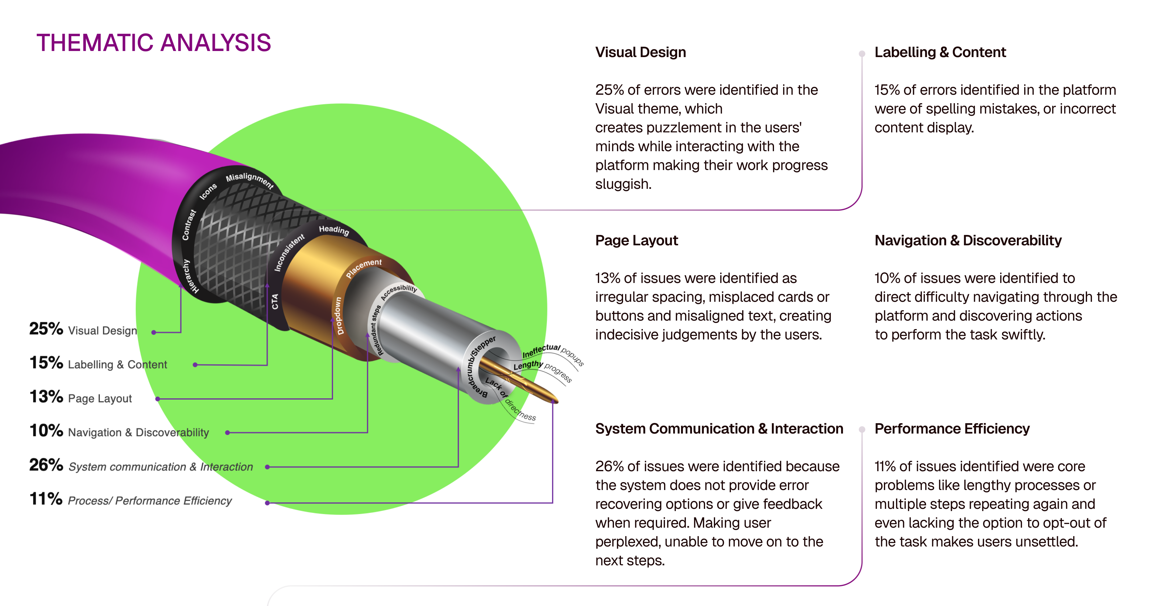
- Thematic Analysis → to identify systemic patterns, not isolated issues
The Goal:To understand and trace friction points hidden in the experience from the inside out — through the language, structure, and behaviour of the system.
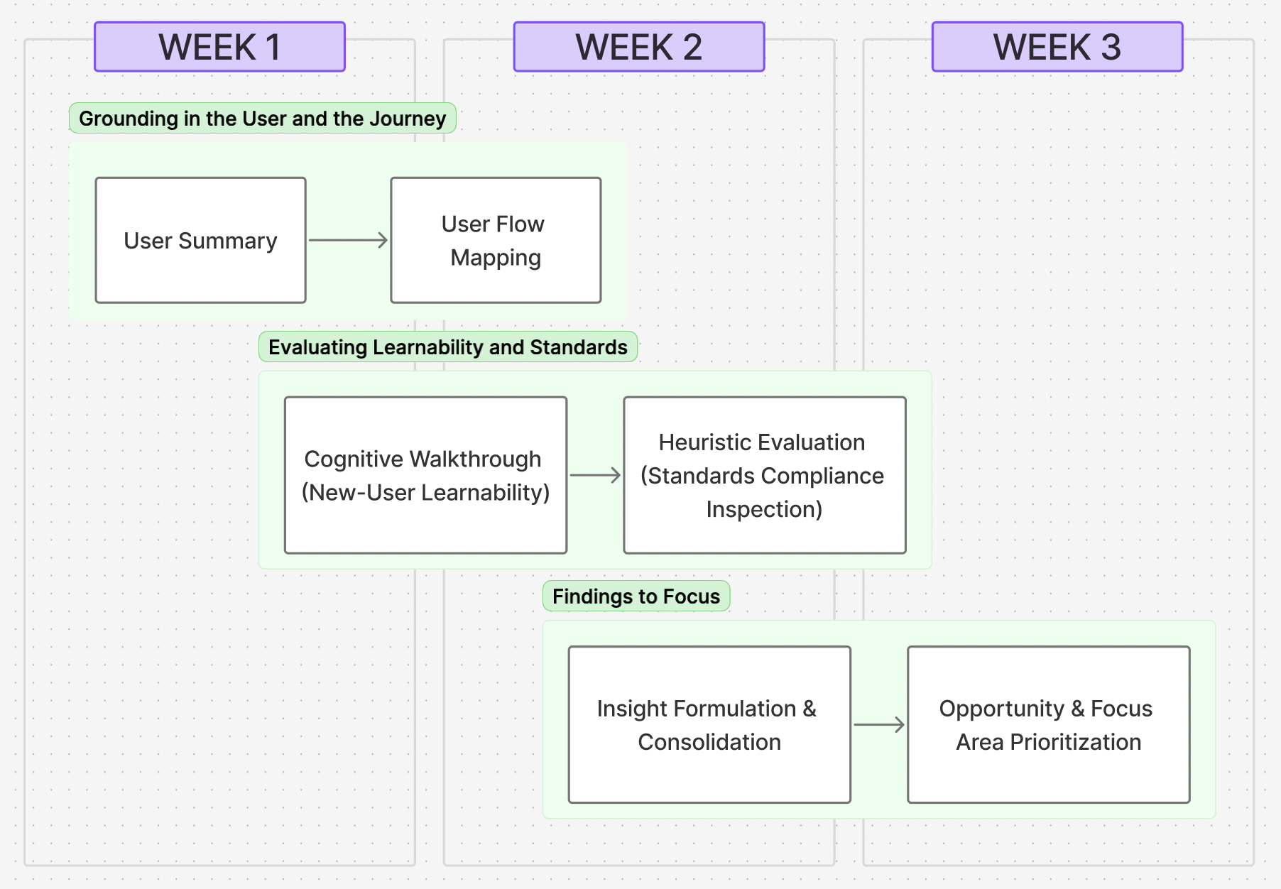
Our 3-Week Design & Evaluation Process
Progressive Discovery-to-Decision framework
Moving from understanding who the system was built for, to identifying where it was breaking, and finally to what mattered most to fix.
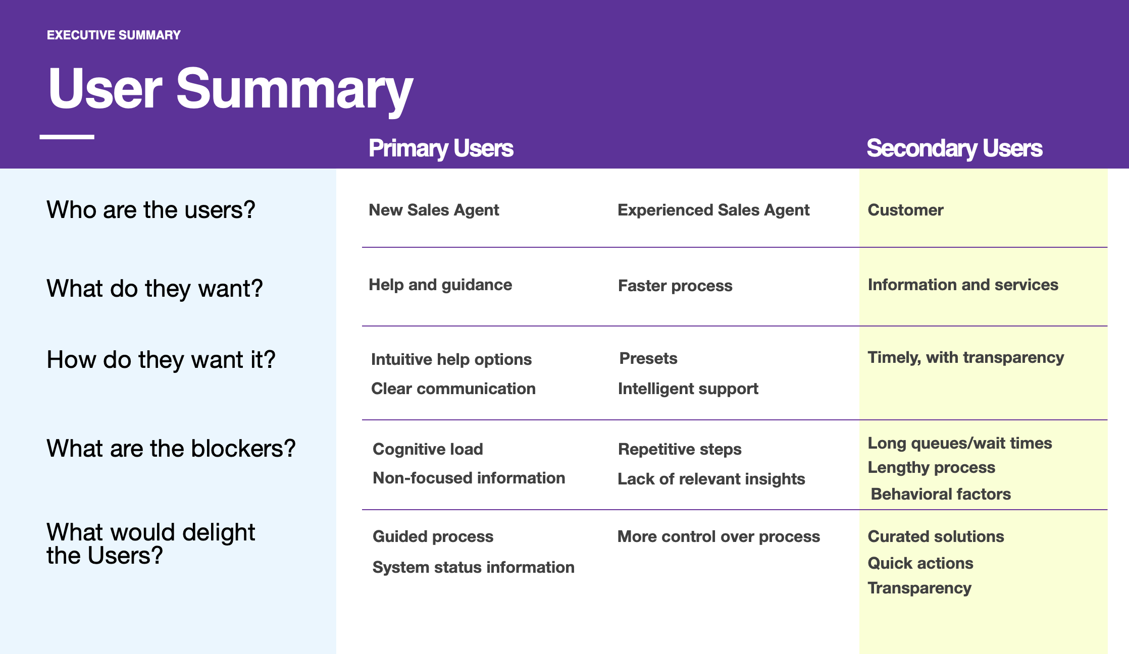
User Summary
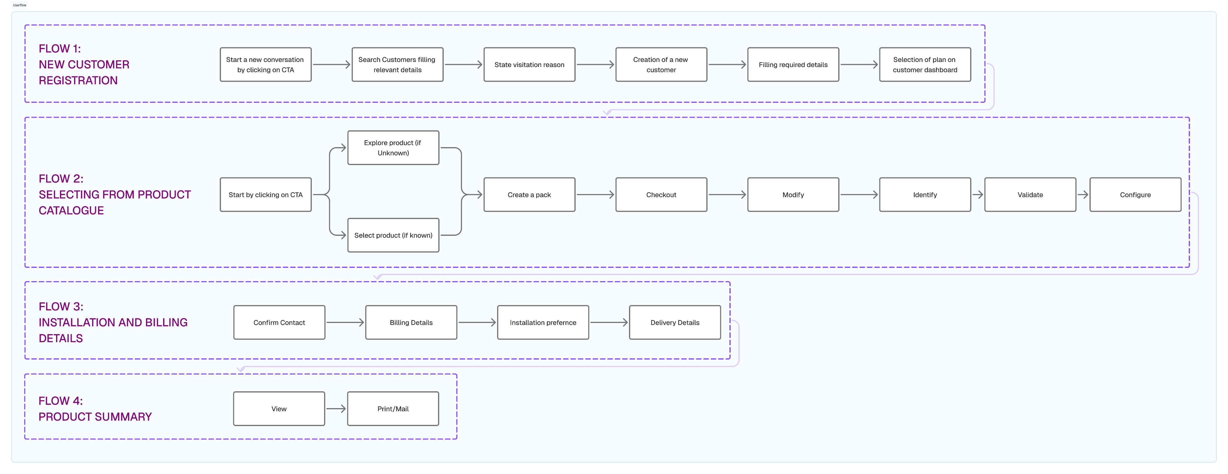
User Flows
Cognitive Walkthrough
Process:(01) Identify Task(02) Identify steps Involved (03) In-depth Evaluation
(04) Step Categorization
(05) Learnability Evaluation
Heuristics Evaluation & Theme Analysis
Process:(01) In-depth Evaluation (02) List of Issues(03) Score Issue
(04) Cluster Issues into Themes
(05) Score Theme
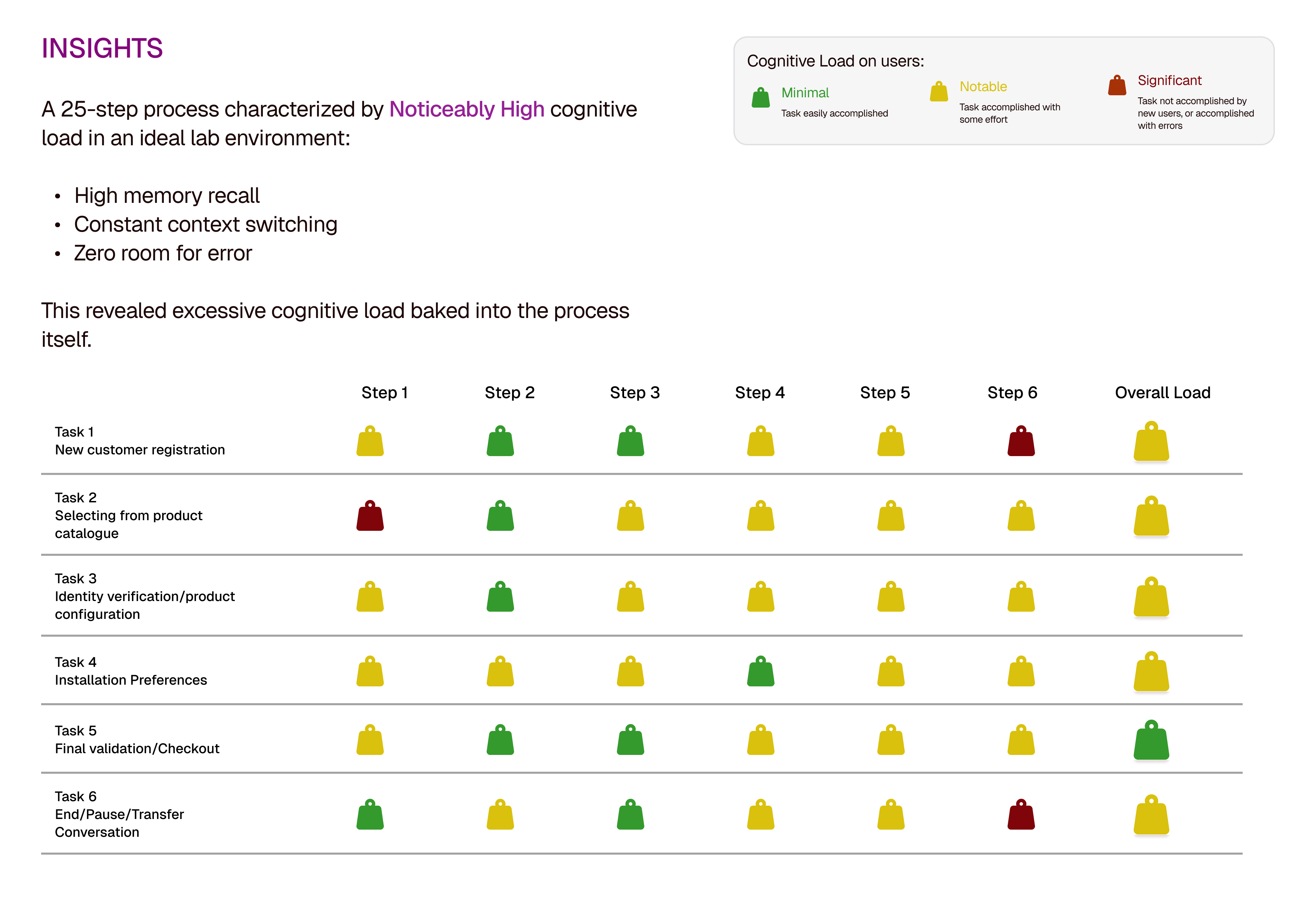
Conclusion
Through cognitive walkthroughs, weighted heuristic evaluation, and thematic analysis, we identified that the core issues were not isolated UI flaws, but a mismatch between a rigid, process-driven system and the realities of a fast-paced, multitasking in-store environment.
The platform demanded perfect memory, linear thinking, and error-free execution—conditions that do not exist in real sales contexts.
- Our recommendations shifted the focus from surface-level fixes to system intelligence: contextual guidance that adapts over time, stronger error recovery, service-driven integration, and continuous UX validation across product maturity. This reframing positioned DOF not just as a transactional tool, but as a sales enablement platform designed to support human behavior rather than fight it.
- Ultimately, this case reinforced a key UX principle for me: great enterprise experiences are not about speed alone—they are about confidence, recovery, and support at the moment of need.