Back
Design Day Visual Communication

Client
WongDoody, an Infosys company
(2024)
Location
India
Industry
Branding
Team
10+ Members
About
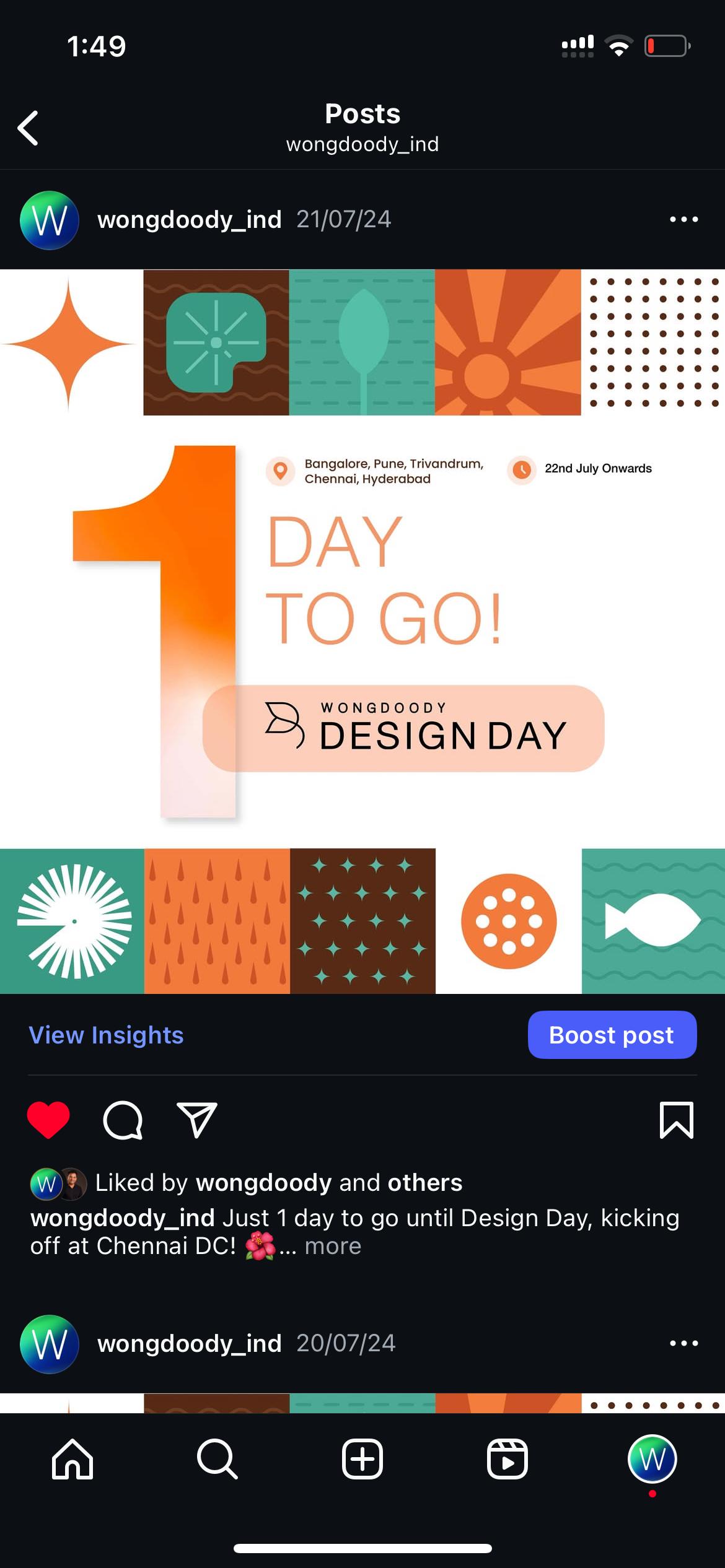
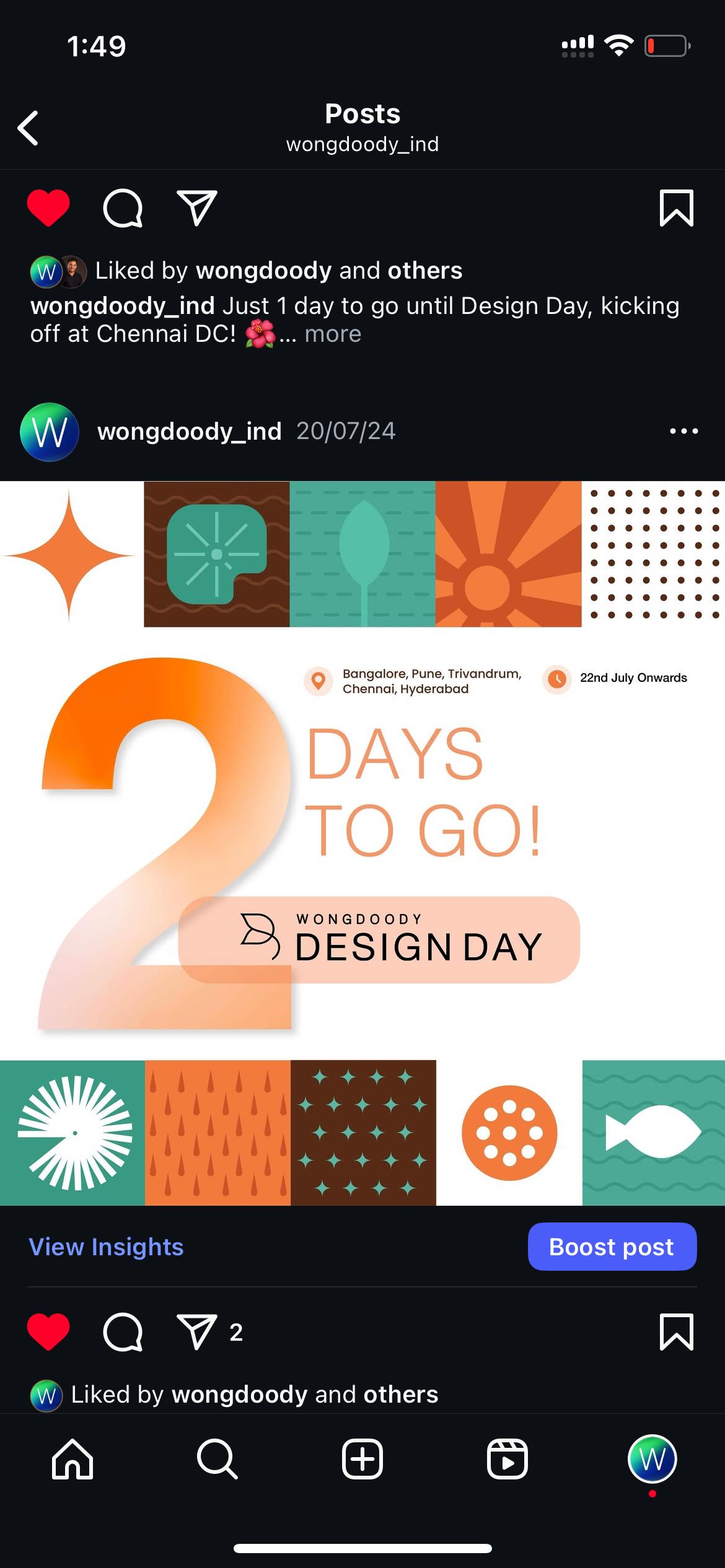
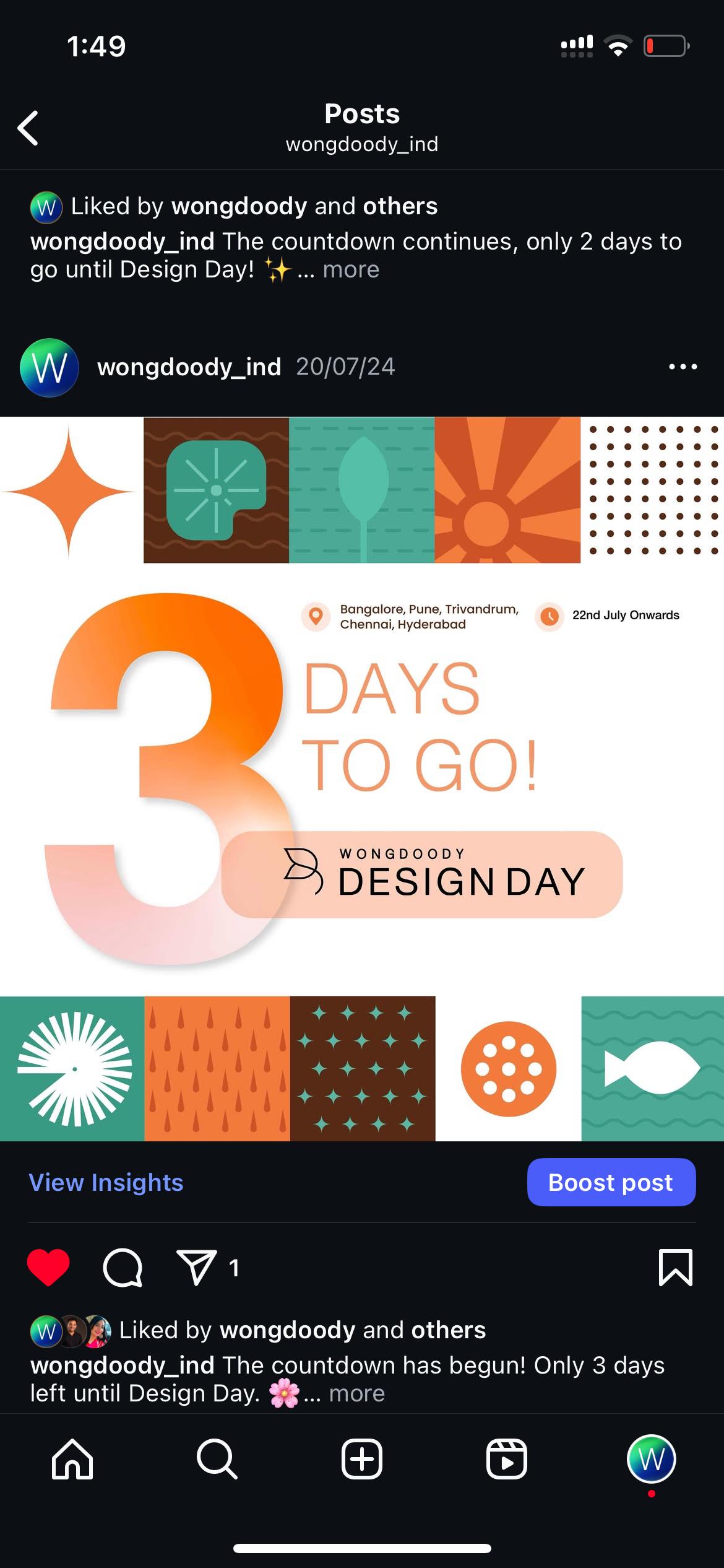
WongDoody decided to celebrate International Design Day 2024 across all five of its India studios, we faced an exciting challenge: how to visually capture the global theme "Is It Kind?" while staying true to both our local identity and the agency's "Incredible Meets Credible" philosophy.
- With just two weeks until launch, our team embarked on a creative sprint to develop a complete branding system that would resonate across all locations.
- Our team was tasked to create a system that needed to work across everything from digital assets to physical merchandise, all while maintaining the professional yet playful spirit of WongDoody.
My Role
Communication
Finalise Logo
Build brand guideline book
Creative Direction
Design asset production for invites, social templates, event merch
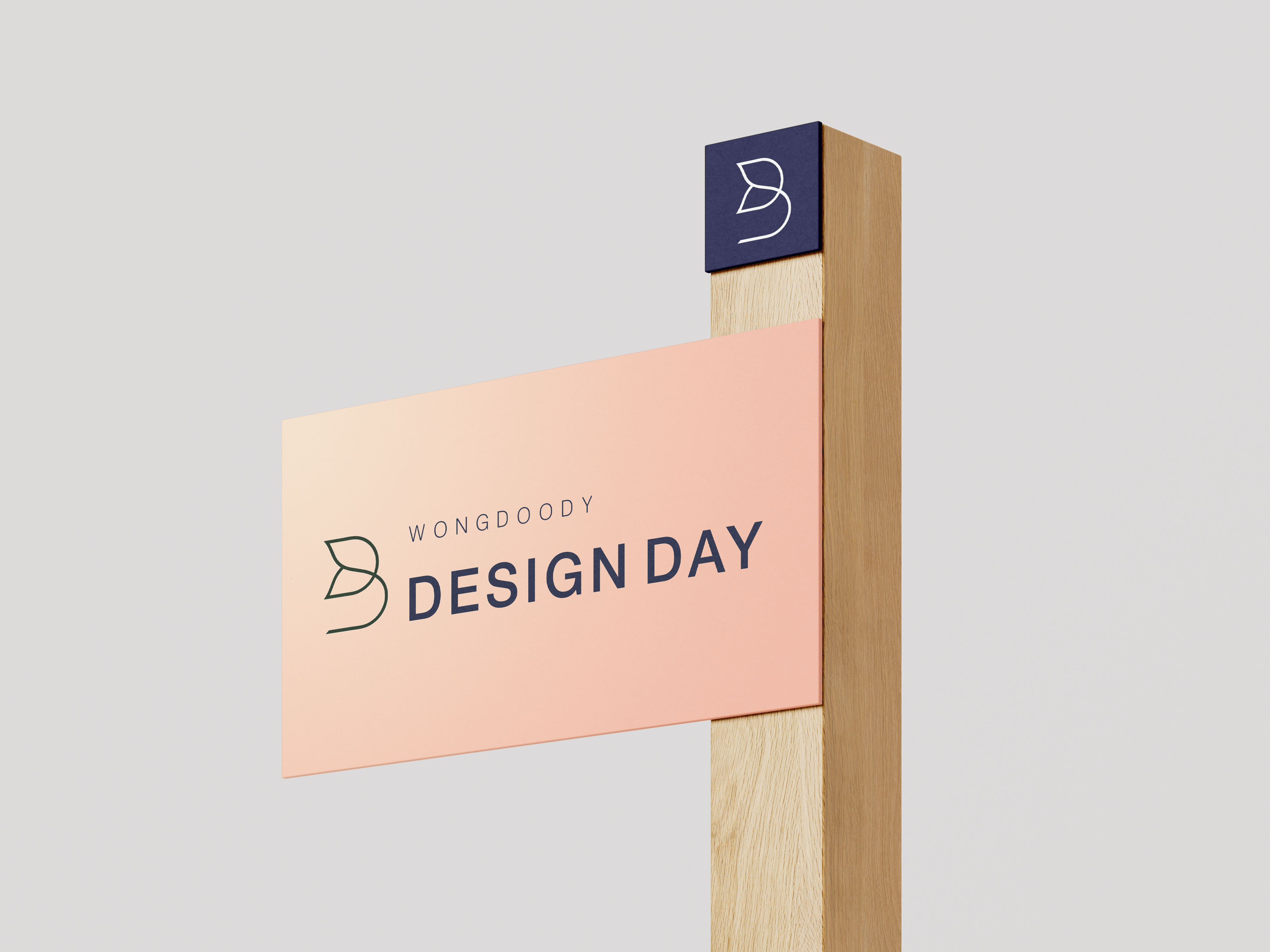
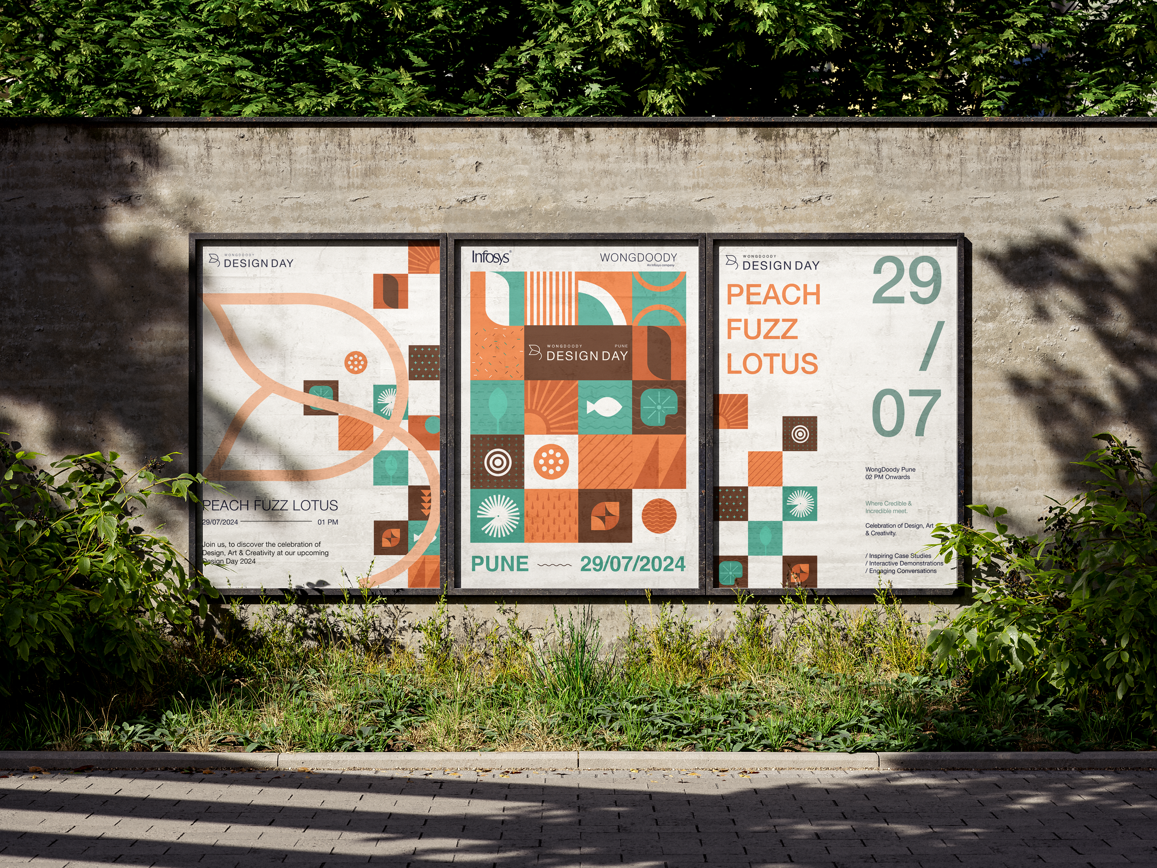
The Visual Identity
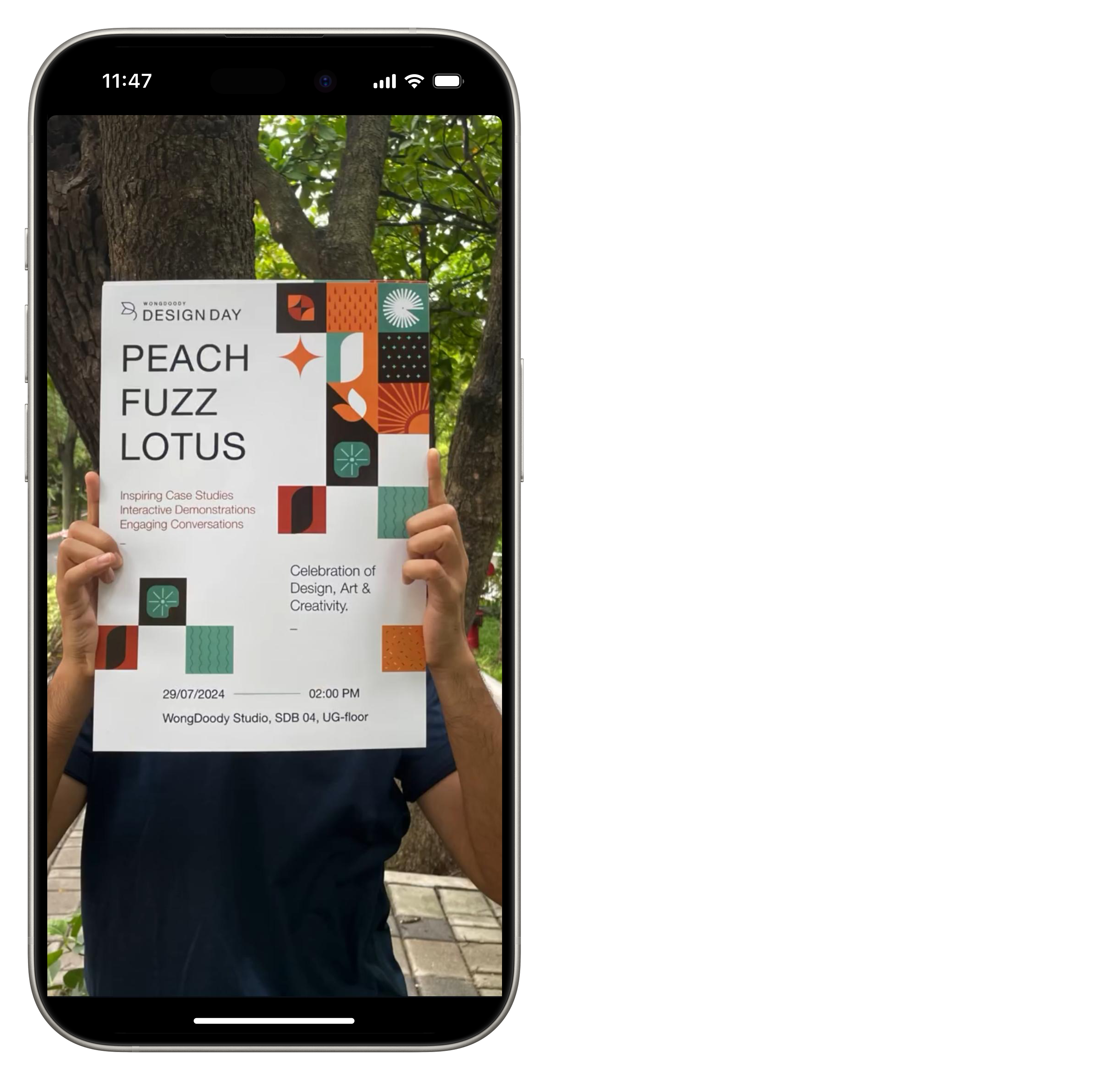
Theme
Peach Fuzz Lotus
"Peach Fuzz Lotus" is a vibrant celebration of India's global influence on design, seamlessly blending the lively hues of Peach Fuzz, the Pantone Color of the Year, with the timeless elegance of the Lotus, India's revered national flower.
This theme embodies the dynamic fusion of India's rich cultural heritage with the innovative trends shaping global design landscapes.
Color Palette
Kindness Palette
Globally current & locally rooted
DescriptionThe palette intentionally mirrors the lotus flower's journey: from deep waters (Midnight Blue) through nurturing stems (Botanical Green) to radiant bloom (Peach Fuzz). Each transition represents a phase of the creative process - from challenge to solution to impact.
PEACH FUZZ
#FFBE98
MID NIGHT BLUE
#050A30
Creme
#FFF5EA
SANTA FE
#AC6654
STROM DUST
#67615A
SLUGGER
#44312B
BOTANICAL
#6F988F
Type
Typeface
Helvetica Neue
DescriptionDeliberate nod to continuity, the Design Day logo employs Helvetica Neue—the very typeface that defines WongDoody's master brand identity. This strategic typographic alignment serves dual purposes: it maintains visual kinship with our established brand heritage while allowing the fresh 'Peach Fuzz Lotus' concept to shine.
HELVETICA
NEUE
Outcome
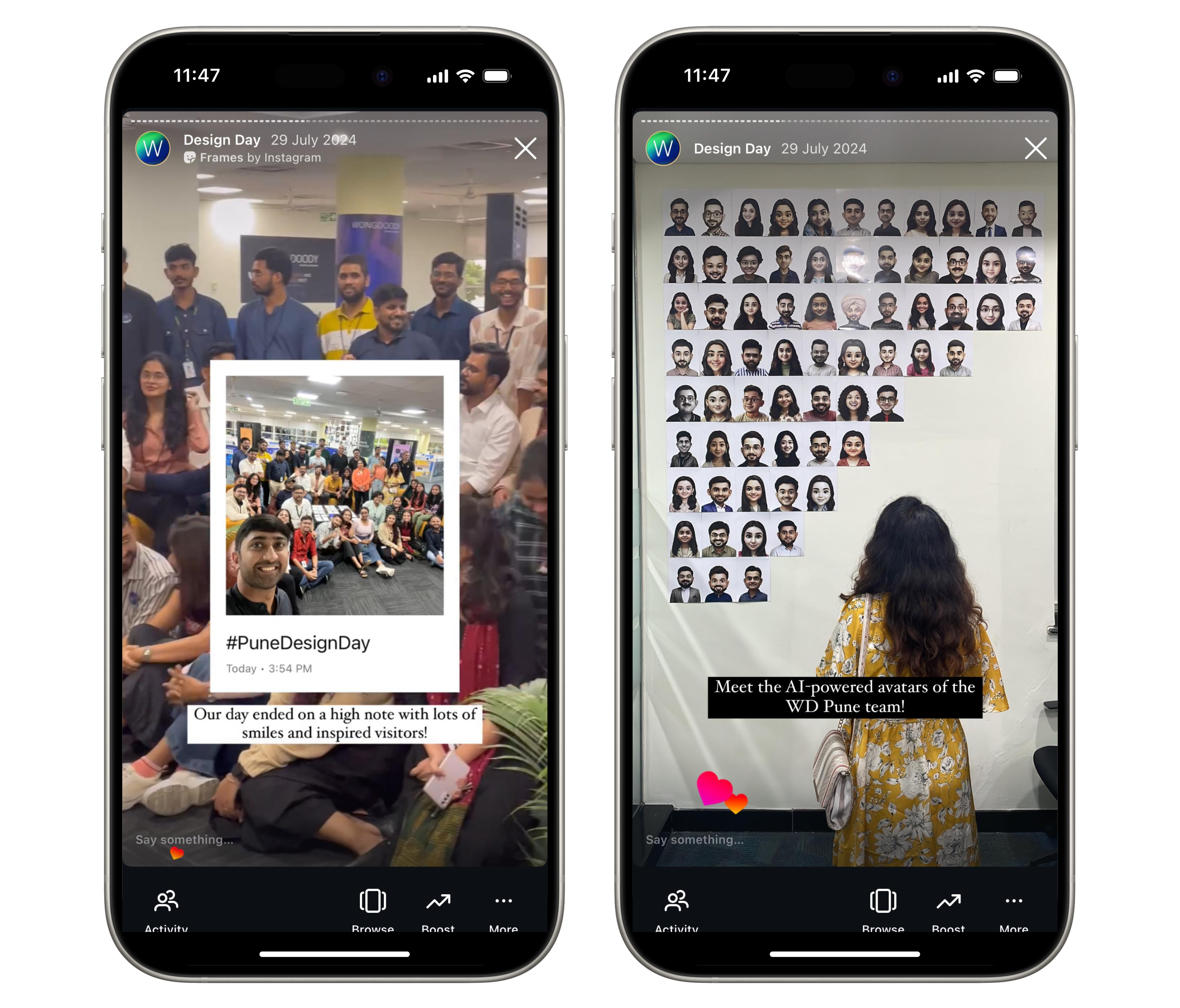
The project became a masterclass in strategic, scalable creativity. By making bold yet calculated decisions—like leveraging AI for rapid copy generation and automating asset templates—we delivered a full branding system that resonated across all five studios without sacrificing quality.
- 90% studio adoption—proving that thoughtful standardisation fuels creativity
- 5+ client visits sparked by the campaign—demonstrating how internal projects can drive external opportunities
- A new agency benchmark for fast-turnaround branding that maintains depth
The enthusiastic adoption across all five studios, client inquiries, and recognition confirmed a truth we’d woven into every asset: When creativity serves compassion, it doesn’t just look good—it does good.